library(tidyverse)
library(ggrepel)
library(waffle)
In May of 2020, Arizona Cardinals receiver, DeAndre Hopkins, joined the Jalen & Jacoby Show. He claimed that he is the best wide receiver in the NFL and compared himself to Julio Jones. Is he really better than “Jet” Jones?
I will take a look at some numbers throughout their careers.
NFLreceiving <- read_csv("~/Desktop/Sports Data/Project/nflreceiving.csv") %>%
  mutate(CtchPct = as.numeric(gsub("%", "", CtchPct)))

JJreceiving <- NFLreceiving %>%
  filter(Player == "Julio Jones")

DHreceiving <- NFLreceiving %>%
  filter(Player == "DeAndre Hopkins")
To start, I am working with NFL offense data from the top 50 players every season, going back to Julio Jones’ rookie year. I will focus on the average yards and receptions that the two receivers have throughout their careers.
RecAvg <- NFLreceiving %>%
  group_by(Player) %>%
  summarise(
    AvgYds = mean(Yds),
    AvgRec = mean(Rec))

JJrecAvg <- JJreceiving %>% summarise(
  AvgYds = mean(Yds),
  AvgRec = mean(Rec))

DHrecAvg <- DHreceiving %>% summarise(
  AvgYds = mean(Yds),
  AvgRec = mean(Rec))
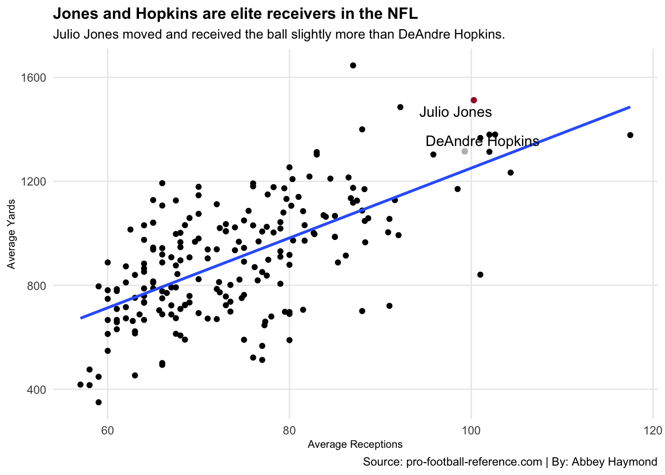
I am taking a look at how Hopkins and Jones compared on offense to other top players in the league. I will pay attention to all the players’ number of yards and receptions to see how much they moved the ball, on average, each season.
I am plotting each point based on average yards and receptions. Then, I will add the linear regression to visualize the relationship between those two variables and where each player falls on that model. I will also label Hopkins and Jones, so it is easier to see how they compare to the rest of the league.
ggplot() +
  geom_point(data=RecAvg, aes(x=AvgRec, y=AvgYds)) +
  geom_smooth(data=RecAvg, aes(x=AvgRec, y=AvgYds), method="lm", se=FALSE) +
  geom_point(data=JJrecAvg, aes(x=AvgRec, y=AvgYds), color="#A71930") +
  geom_point(data=DHrecAvg, aes(x=AvgRec, y=AvgYds), color="grey") +
  geom_text_repel(data=JJrecAvg, aes(x=AvgRec, y=AvgYds, label="Julio Jones")) +
  geom_text_repel(data=DHrecAvg, aes(x=AvgRec, y=AvgYds, label="DeAndre Hopkins")) +
  labs(
    x="Average Receptions",
    y="Average Yards",
    title="Jones and Hopkins are elite receivers in the NFL",
    subtitle="Julio Jones moved and received the ball slightly more than DeAndre Hopkins. ",
    caption="Source: pro-football-reference.com | By: Abbey Haymond") +
  theme_minimal() +
  theme(
    plot.title = element_text(size = 12, face = "bold"),
    axis.title = element_text(size = 8),
    plot.subtitle = element_text(size=10),
    panel.grid.minor = element_blank())
## `geom_smooth()` using formula 'y ~ x' This chart shows that both Jones and Hopkins are close to the top right portion of the model, which tells me that they are higher in comparison to other top players in the league.
Julio Jones is slightly higher than DeAndre Hopkins, but they are comparable when it comes to how much they caught and moved the ball. We can tell that they are both exceptional wide receivers.
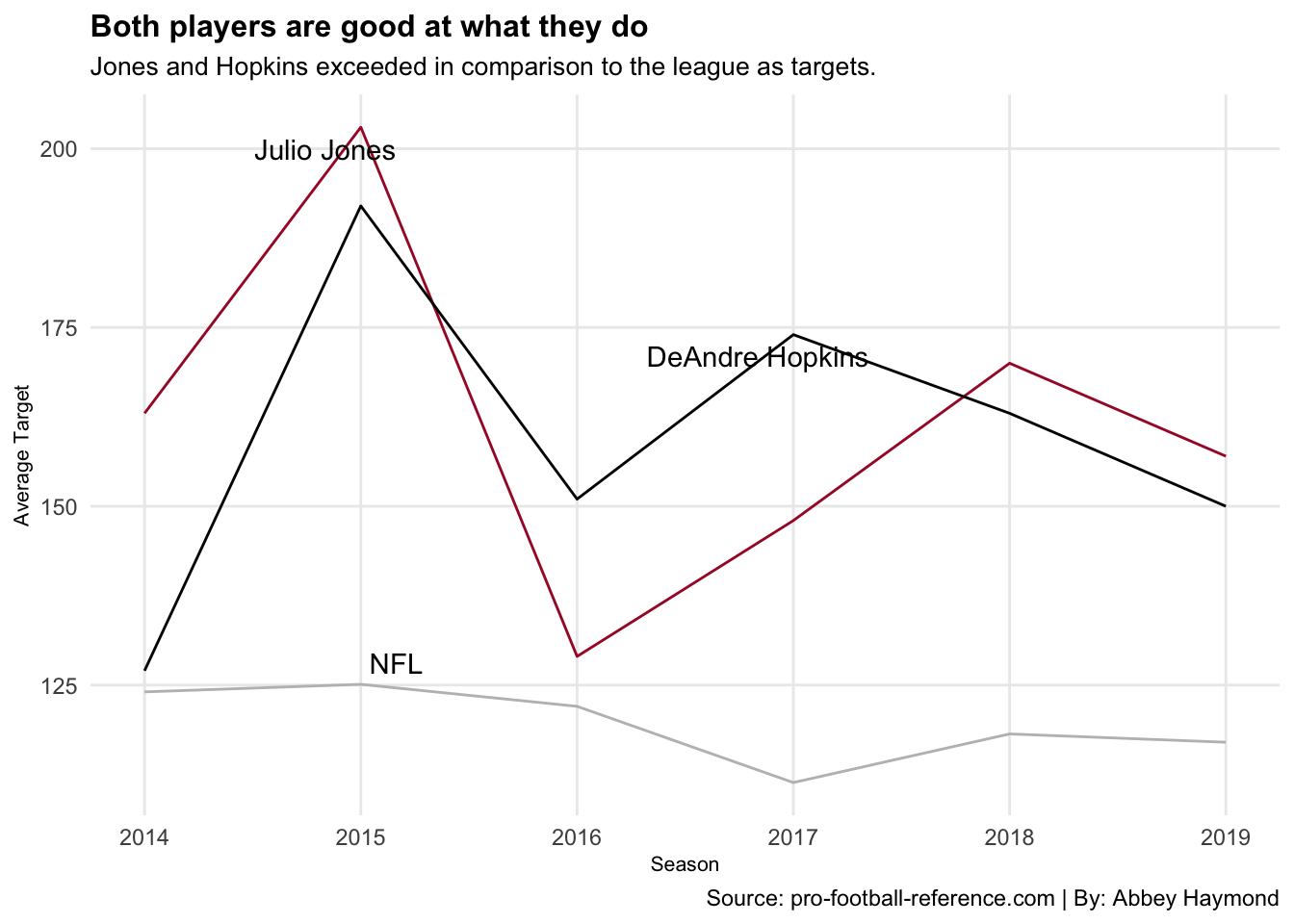
Another way to identify a good receiver is by their number of targets. The targeted receiver tends to be the best receiver on the field for that play; the better a player does his job, the more likely he is going to be the target.
I am looking at the same data and selecting seasons that both Jones and Hopkins played a majority of the games. I will compare the number of targets that they had those seasons to the rest of the league.
TgtAvg <- NFLreceiving %>%
  group_by(Season) %>% summarise(
    AvgTgt = mean(Tgt)) %>%
  select(Season, AvgTgt) %>%
  subset(Season>2013) %>%
  subset(Season<2020)

JJreceivingclean <- JJreceiving %>%
  select(Season, Tgt) %>%
  subset(Season>2013)

DHreceivingclean <- DHreceiving %>%
  select(Season, Tgt) %>%
  subset(Season<2020)

TgtAvg2015 <- TgtAvg %>%
  select(Season, AvgTgt) %>%
  subset(Season==2015)

JJreceiving2015 <- JJreceivingclean %>%
  select(Season, Tgt) %>%
  subset(Season==2015)

DHreceiving2017 <- DHreceivingclean %>%
  select(Season, Tgt) %>%
  subset(Season==2017)
I am looking at Jones’ and Hopkin’s number of targets on average each season and will highlight what the lines represent.
ggplot() +
  geom_line(data=TgtAvg, aes(x=Season, y=AvgTgt, group="Season"), color="grey") +
  geom_line(data=JJreceivingclean, aes(x=Season, y=Tgt), color="#A71930") + scale_x_continuous() +
  geom_line(data=DHreceivingclean, aes(x=Season, y=Tgt), color="black") +
  geom_text_repel(data=TgtAvg2015, aes(x=Season, y=AvgTgt, label="NFL")) +
  geom_text_repel(data=JJreceiving2015, aes(x=Season, y=Tgt, label="Julio Jones")) +
  geom_text_repel(data=DHreceiving2017, aes(x=Season, y=Tgt, label="DeAndre Hopkins")) + scale_x_continuous() + theme_minimal() +
  labs(
    x="Season",
    y="Average Target",
    title="Both players are good at what they do",
    subtitle="Jones and Hopkins exceeded in comparison to the league as targets.",
    caption="Source: pro-football-reference.com | By: Abbey Haymond") +
  theme_minimal() +
  theme(
    plot.title = element_text(size = 12, face = "bold"),
    axis.title = element_text(size = 8),
    plot.subtitle = element_text(size=10),
    panel.grid.minor = element_blank())
## Scale for 'x' is already present. Adding another scale for 'x', which will
## replace the existing scale. Again, the data for both players are fairly similar. Throughout their careers, their average number of targets hike above and below the other. They exceeded in comparison to the league in the average number of targets during this period to suggest that Jones and Hopkins are both good at what they do.
Both receivers’ trends are comparable, so I want to look at one last area. Jones and Hopkins can move the ball and make their routes, but what is the result of those plays?
This chart shows that both Jones and Hopkins are close to the top right portion of the model, which tells me that they are higher when compared to other top players in the league. They both have a high number of average receptions and yards.
I am working with the same data, but I will focus on their average number of touchdowns and first downs throughout both players’ careers.
JJdownAvg <- JJreceiving %>% summarise(
    AvgTD = mean(TD),
    Avg1D = mean(`1D`))

DHdownAvg <- DHreceiving %>% summarise(
    AvgTD = mean(TD),
    Avg1D = mean(`1D`))

NFLdownAvg <- NFLreceiving %>% summarise(
    AvgTD = mean(TD),
    Avg1D = mean(`1D`))
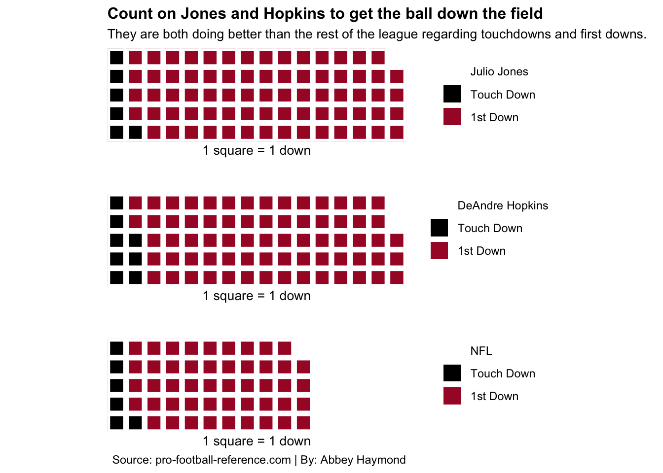
I found that Julio Jones had an average of 6.71 touchdowns and 73.29 first downs each season, while Deandre Hopkins had an average of 8.29 touchdowns and 70.57 first downs. To compare the two to the best in the league, I also found that the top 50 players had an average of 6.23 touchdowns and 48.29 first downs each season.
jj <- c("Julio Jones" = 0, "Touch Down"= 6.71, "1st Down"= 73.29)
dh <- c("DeAndre Hopkins"= 0, "Touch Down"= 8.29, "1st Down"= 70.57, 1.14)
nfl <- c("NFL"= 0, "Touch Down"= 6.23, "1st Down"= 48.29, 25.48)
I am charting these stats to compare them to the rest of the league’s average. I will pay attention to all the players’ number of touchdowns and first downs to see how effective they are with the ball, on average, each season.
iron(
 waffle(jj,
        rows = 5,
        title="",
        xlab="1 square = 1 down",
        colors = c("white", "black", "#A71930", "white")) +
   labs(title = "Count on Jones and Hopkins to get the ball down the field", subtitle = "They are both doing better than the rest of the league regarding touchdowns and first downs.", fill = "Julio Jones") +
  theme(
    plot.title = element_text(size = 12, face = "bold"),
    axis.title = element_text(size = 8),
    plot.subtitle = element_text(size=10),
    panel.grid.minor = element_blank()),
 waffle(dh,
        rows = 5,
        title="",
        xlab="1 square = 1 down",
        colors = c("white", "black", "#A71930", "white")) +
  theme(
    plot.title = element_text(size = 12),
    axis.title = element_text(size = 8),
    plot.subtitle = element_text(size=10),
    panel.grid.minor = element_blank()),
 waffle(nfl,
        rows = 5,
        title="",
        xlab="1 square = 1 down",
        colors = c("white", "black", "#A71930", "white")) +
  theme(
    plot.title = element_text(size = 12),
    axis.title = element_text(size = 8),
    plot.subtitle = element_text(size=10),
    panel.grid.minor = element_blank()) +
  labs(caption = "Source: pro-football-reference.com | By: Abbey Haymond"))
And again, to no one’s surprise, we can see that the two receivers have similar results when they receive the ball. They are both doing better than the rest of the league regarding touchdowns and first downs.
Julio Jones averages slightly higher with the number of first downs each season. On the other hand, DeAndre Hopkins averages a bit more with the number of touchdowns.
Just from looking at this data, it is apparent that both Jones and Hopkins are elite wide receivers in the NFL. Comparing the players’ stats showed that they have similar numbers. It also showed that they excelled in all areas, while one player sometimes did slightly better than the other.
However, this still gives me an answer to my question. While DeAndre Hopkins is comparable to Julio Jones, he is not better than him.